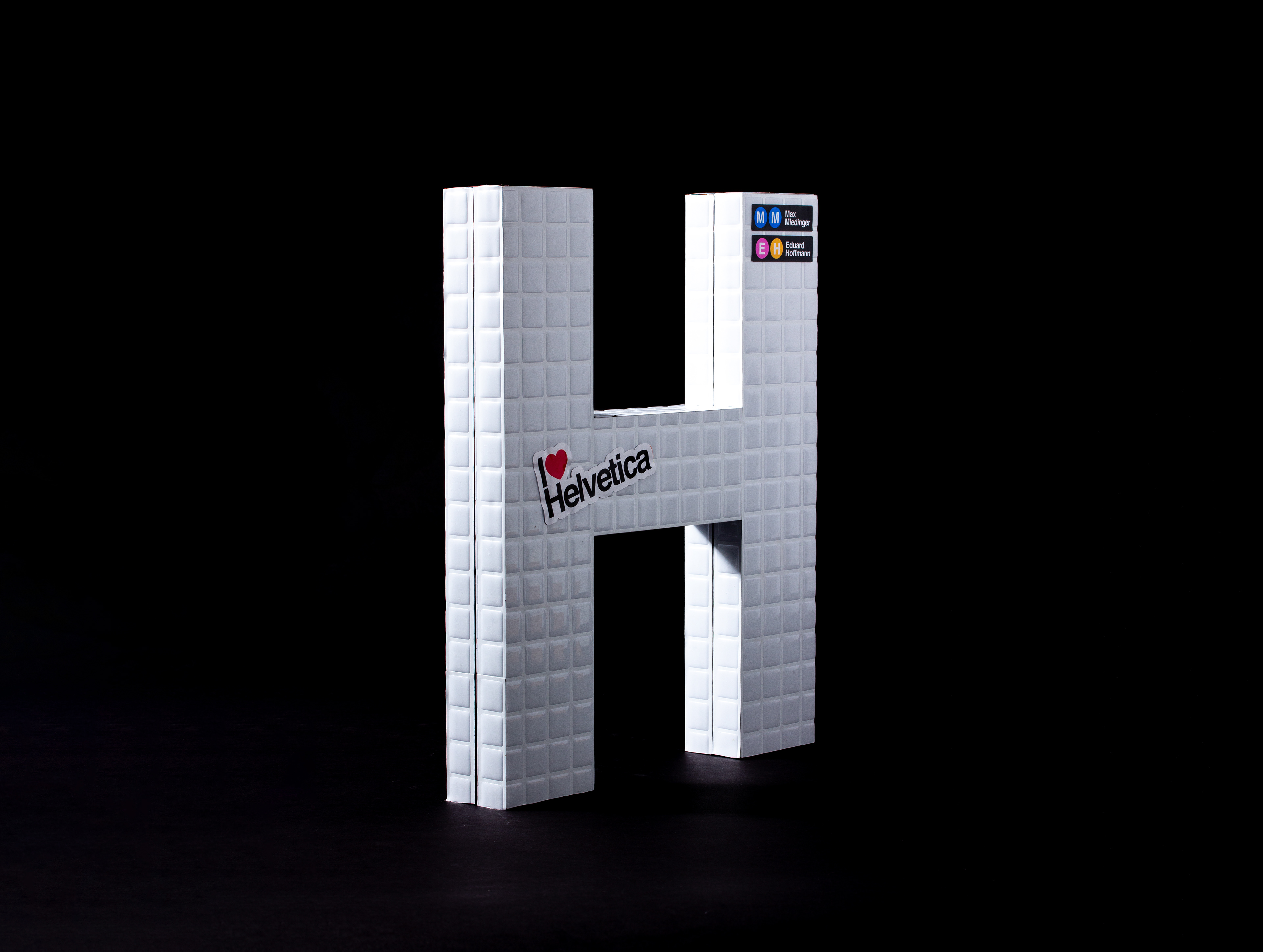
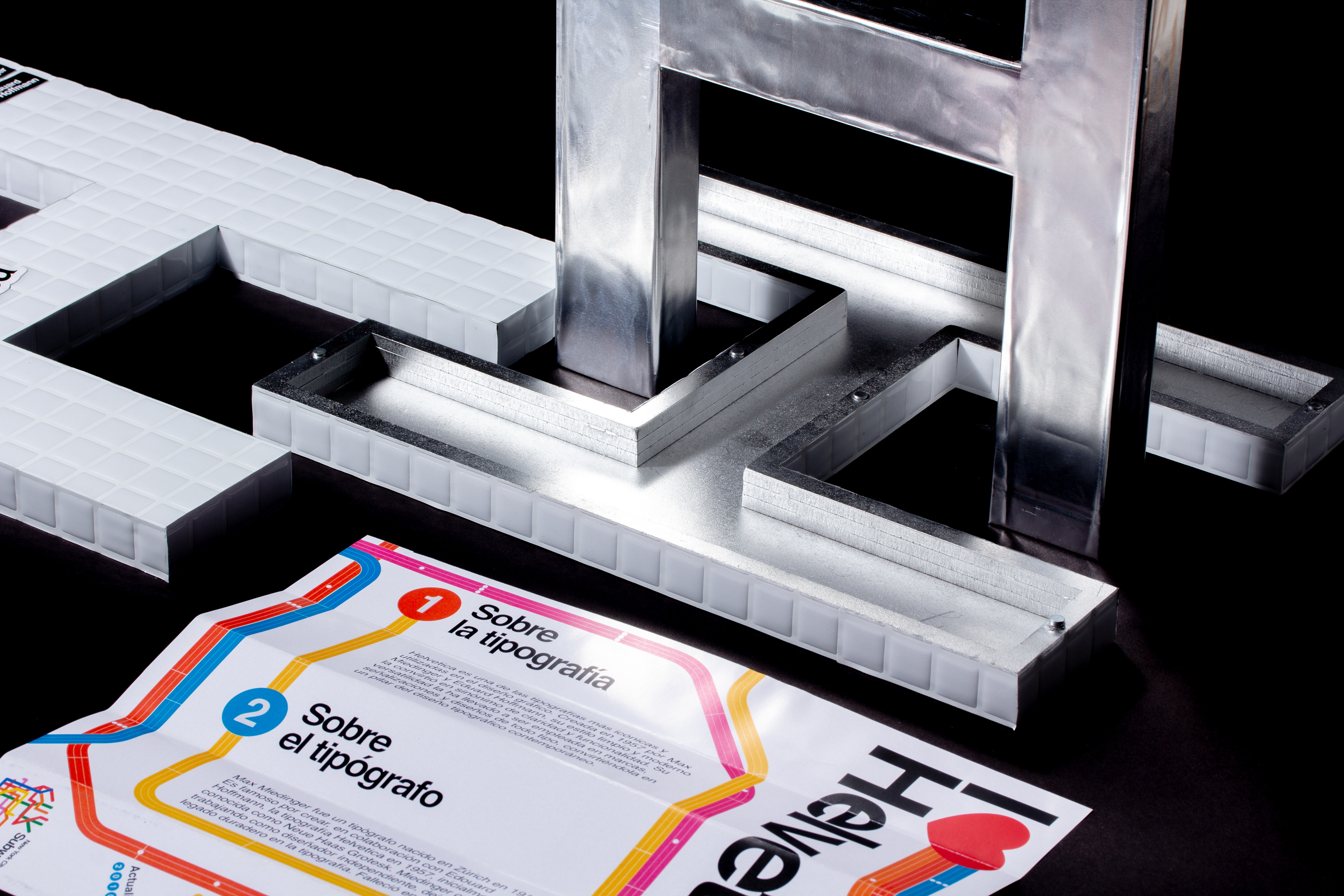
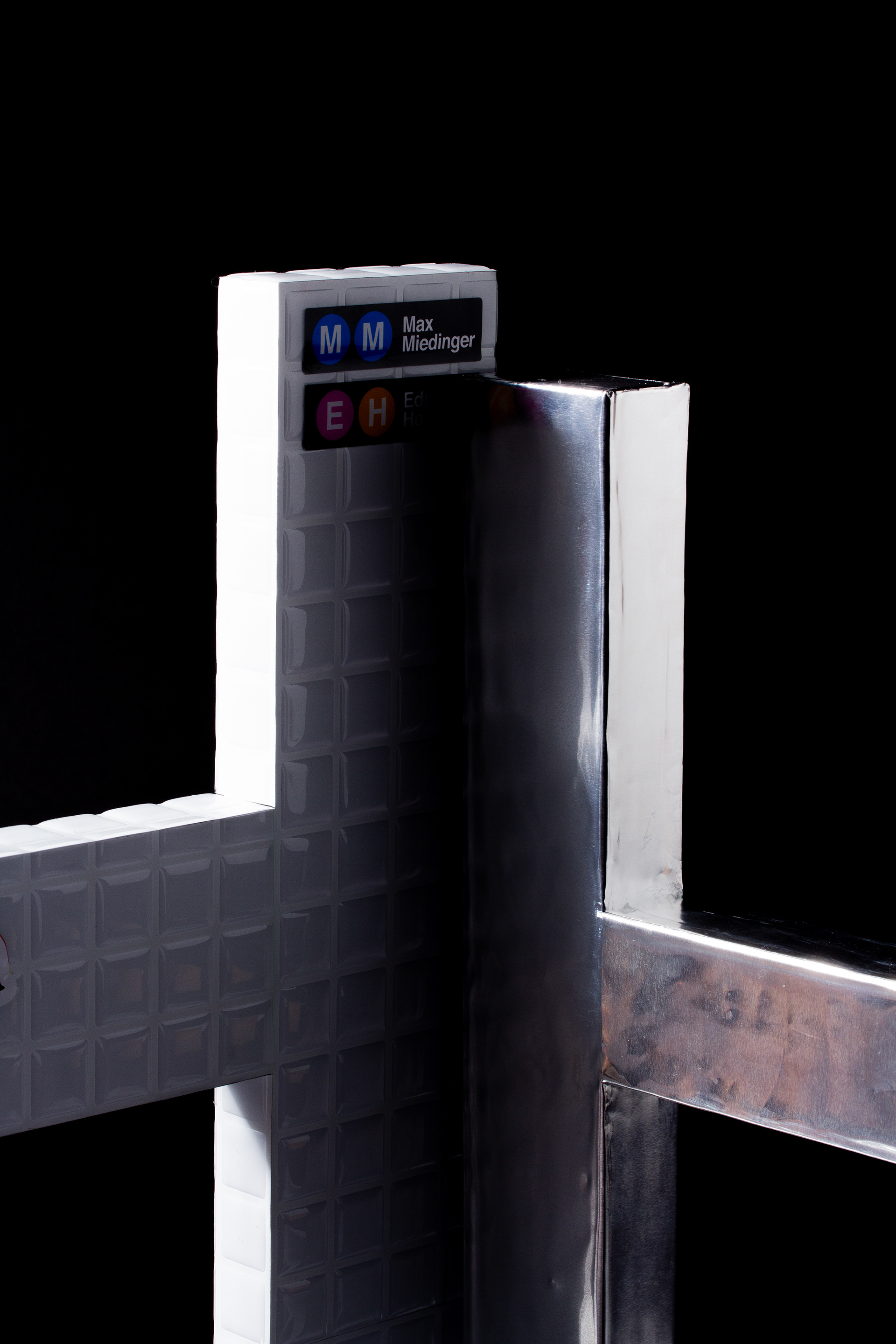
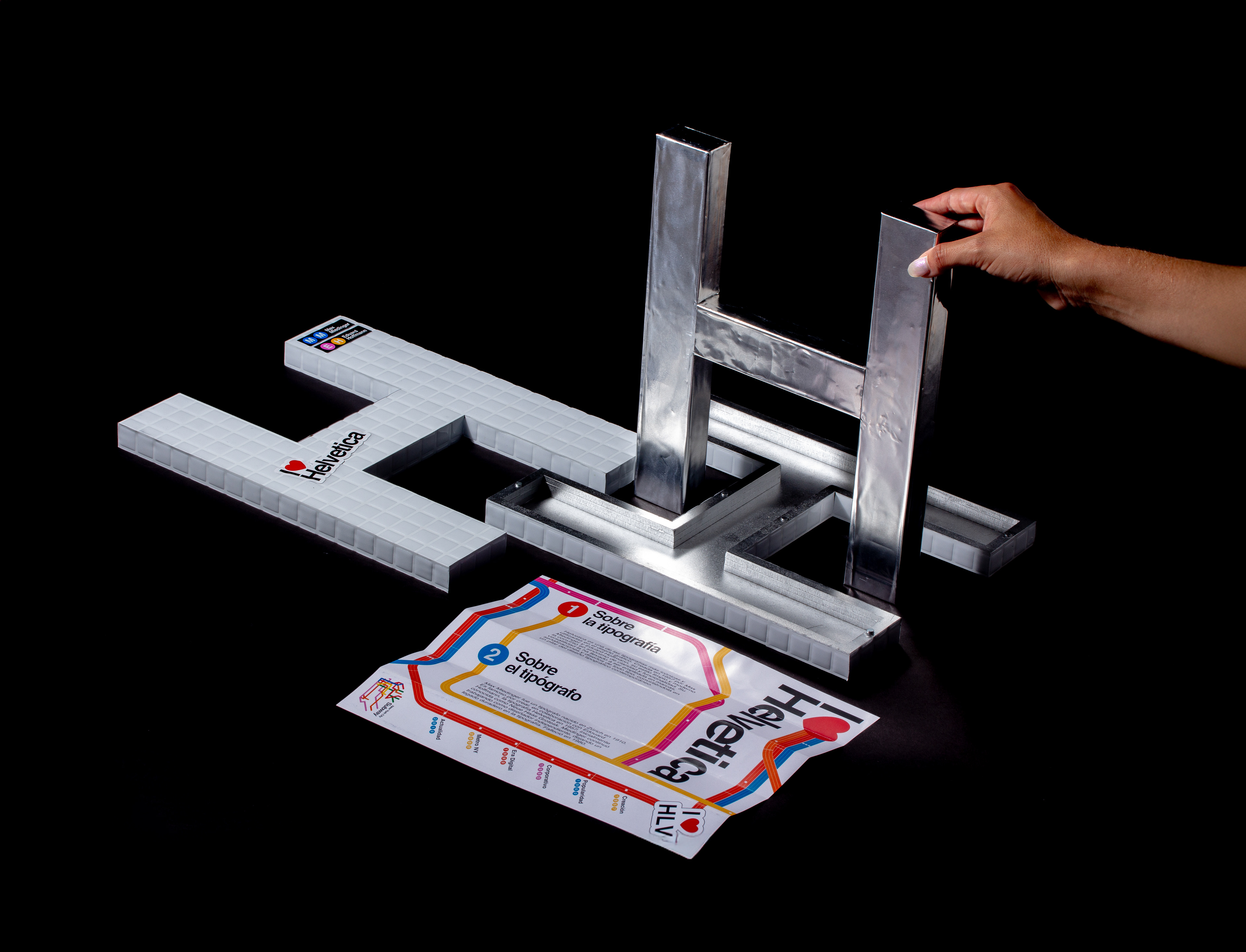
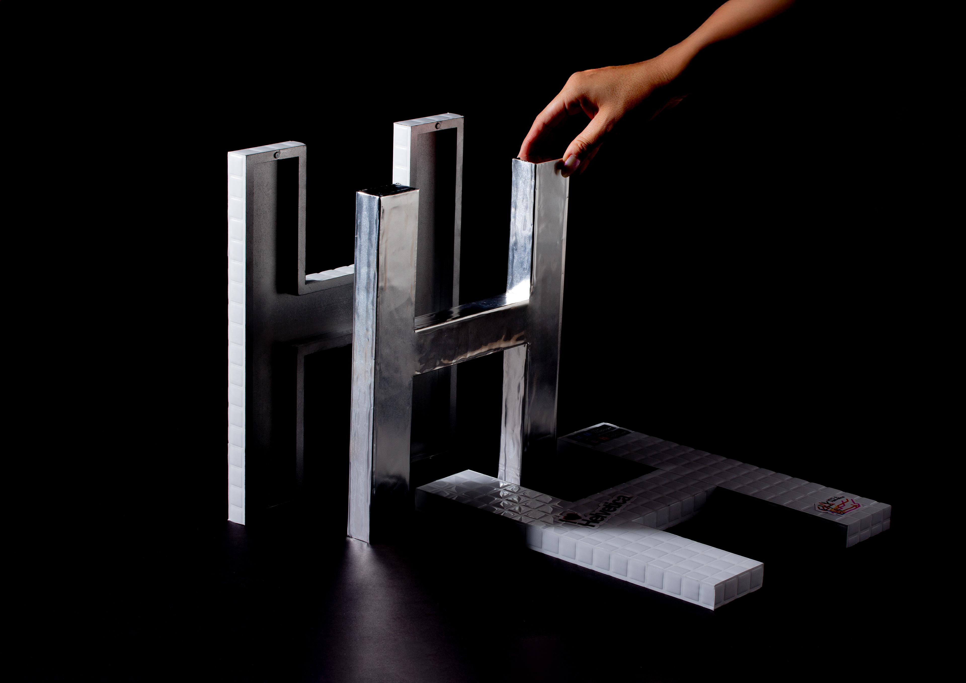
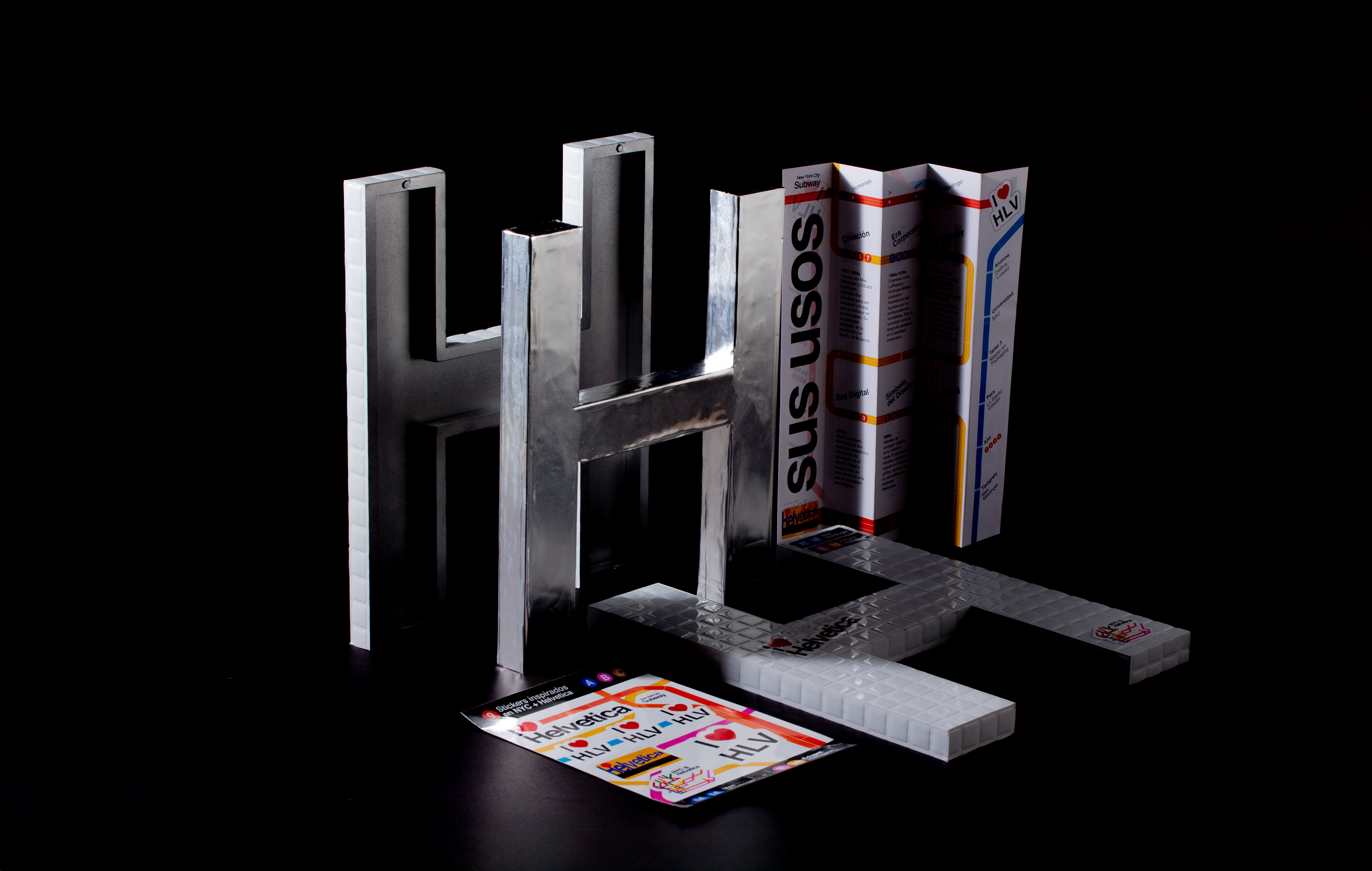
The project’s name stems from the idea of paying tribute to a typeface by designing a packaging for one of its characters. In this case, I chose Helvetica, a modern and functional typeface that became iconic through its use in the New York City subway signage.
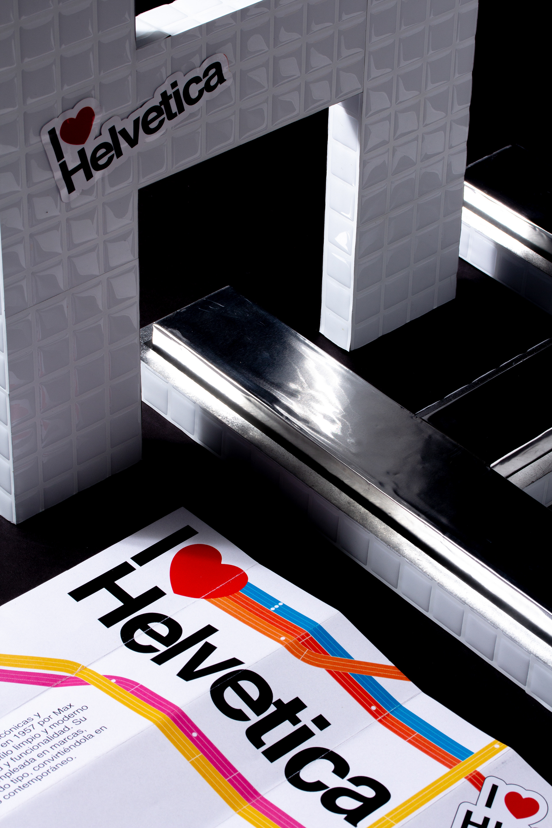
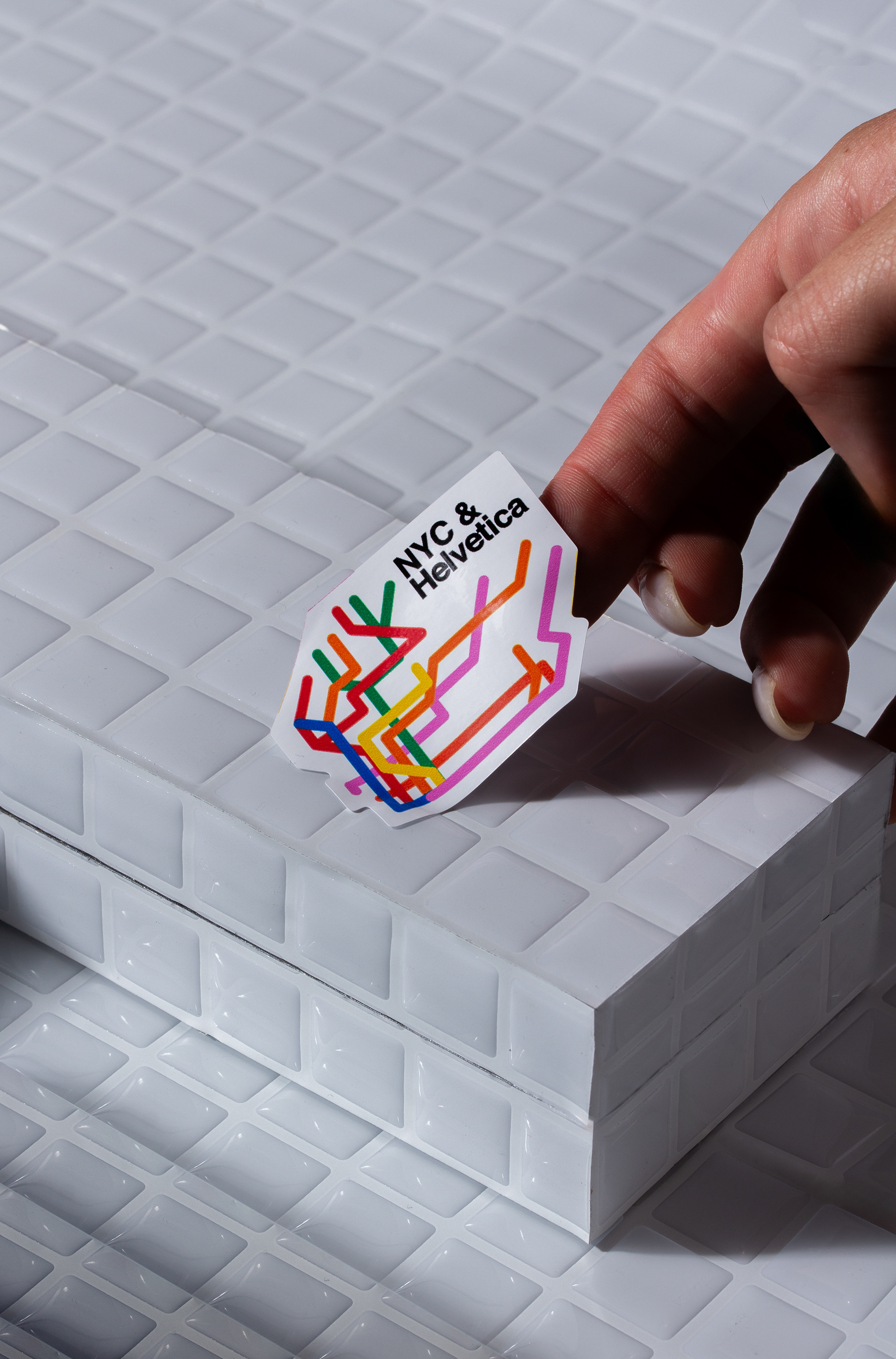
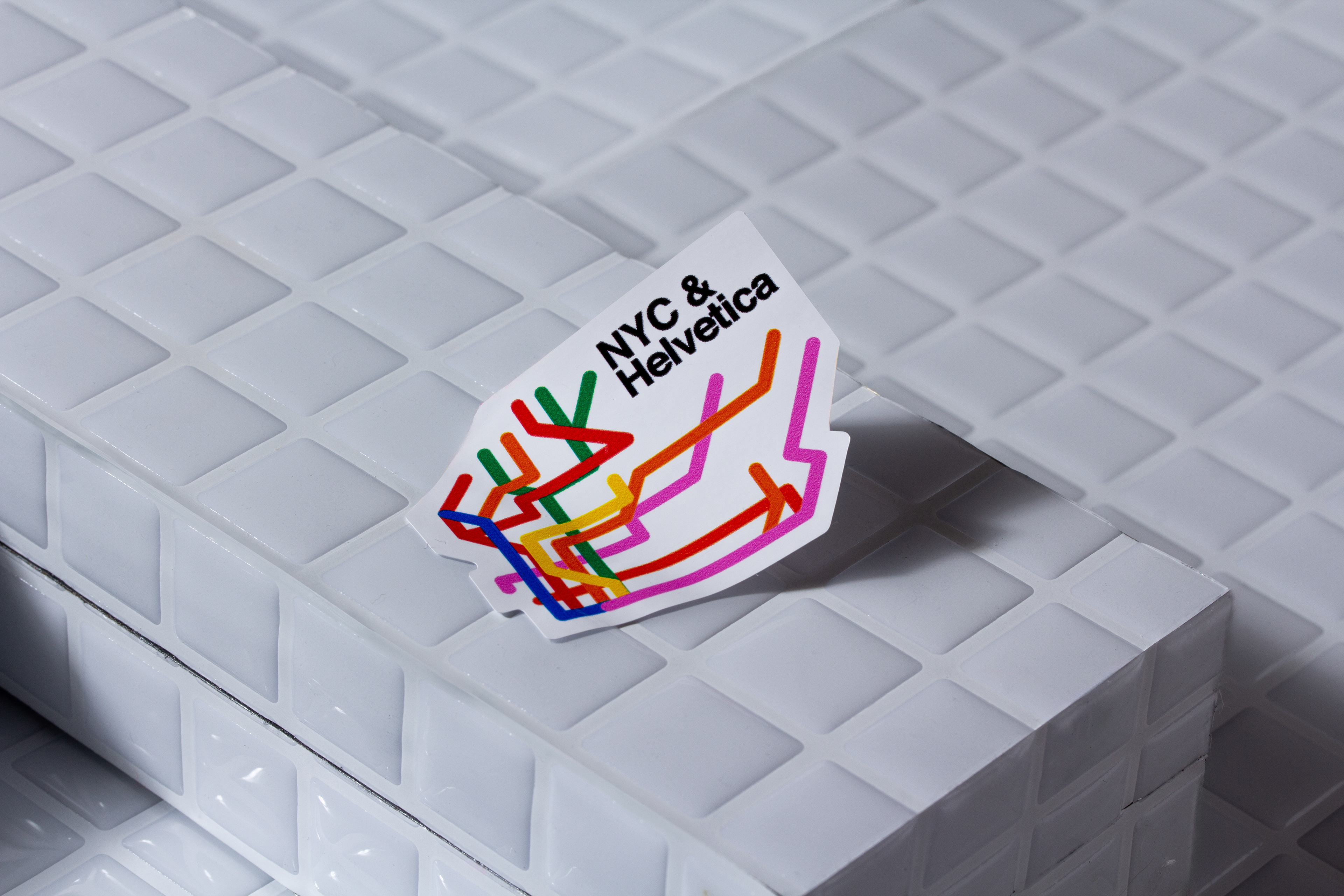
The concept is rooted in this iconic application. To reflect the subway’s atmosphere, I used materials that represent the metallic and industrial interior of the trains. For the exterior, I was inspired by the white mosaic walls of the stations, which over time become covered in graffiti and stickers, symbolizing the passage of time and the urban appropriation of public space.

project x @pepaluquez - photos x @LoSientoEstudio
BAU, Centro Universitario de Artes y Diseño de Barcelona
Thank u ℗